Thursday, April 10, 2014

3 Birds Studio Designs

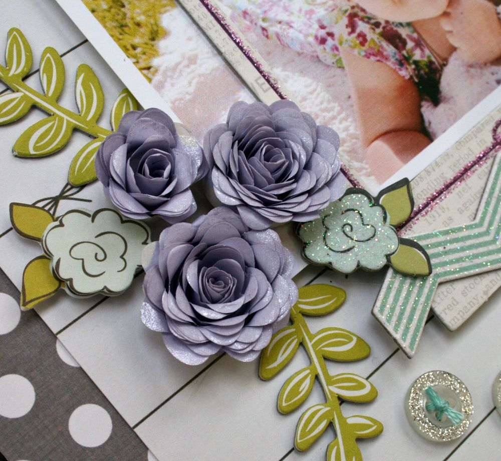
Just sharing a layout that I made for 3 Birds Studio's Blog using the Graceful Seasons Collection.  I'm seriously continuously amazed at how versatile this collection is.  For this layout, I was playing with the soft colors in the collection.  The grey papers and embellishments give a really pretty contrast to the softer colors.
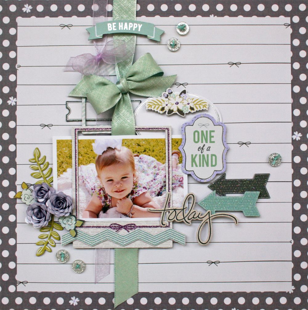

I love chipboard pieces that are included, too!  There are so many title options and great shapes.  Adding glitter and foil to many of the pieces really sends them over the top!  They are so pretty!
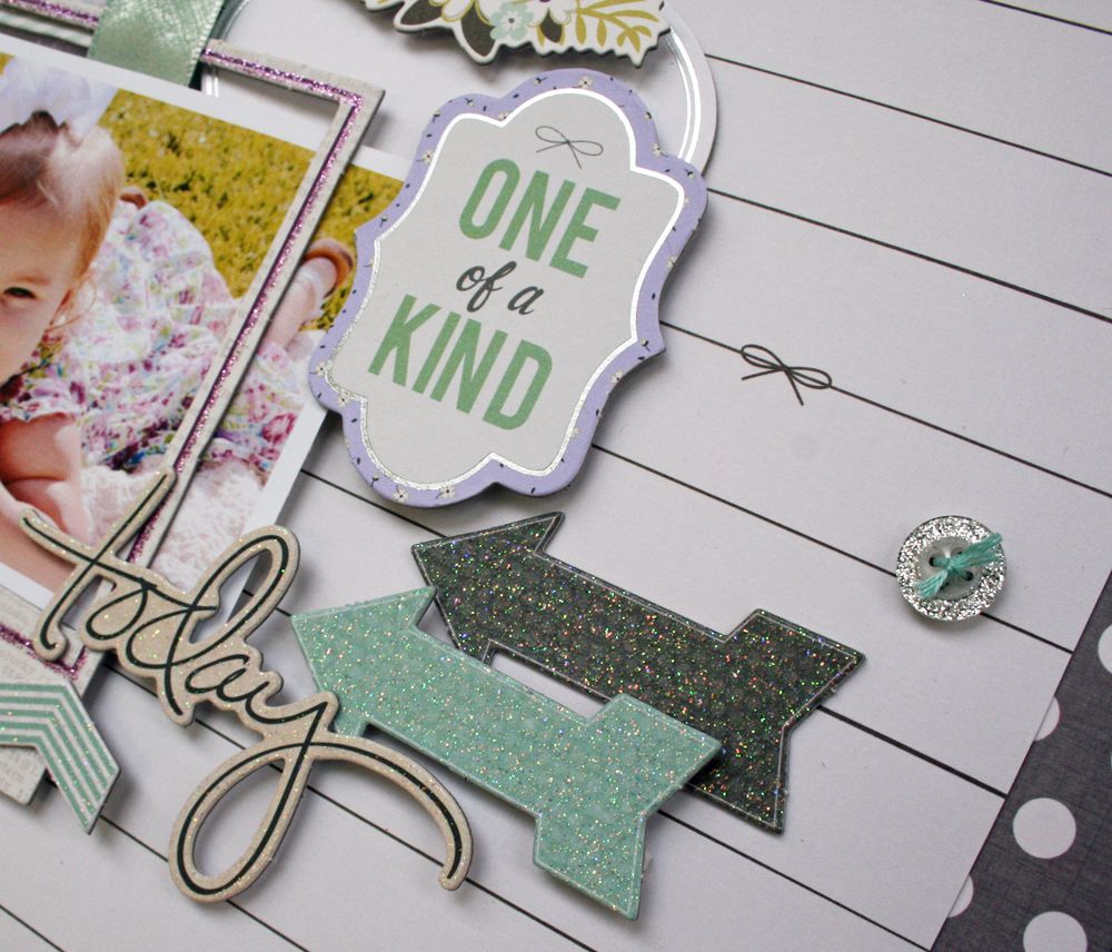
 

Since I love flowers, the Quilled Card Kit pieces are making an appearance on many of my pages.  For these flowers, I added a touch of pearly mist to add a bit of shine.
 

Finally, a couple of ribbon bows worked over and under the photo and frames for a touch of my style and a bit more interest and it's done!  
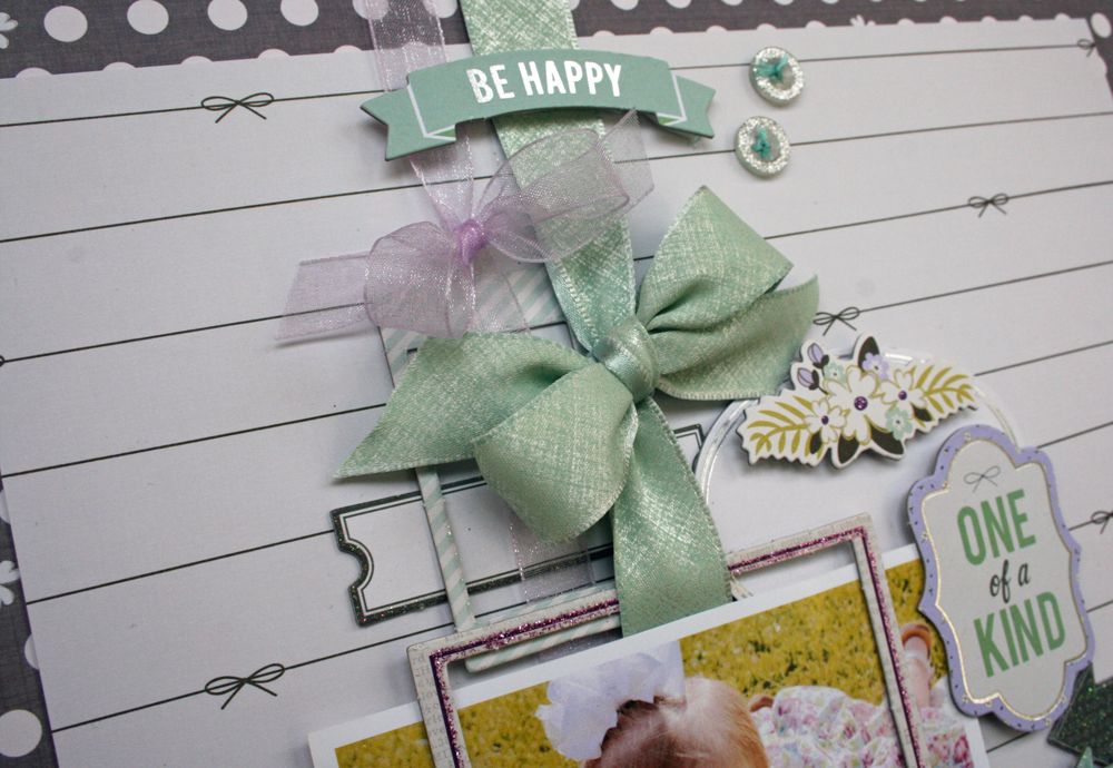


Be sure to stop by the 3 Birds Blog to see more of what the Design Team is up to.  Also, don't forget that this collection is available on the HSN website!  

You will love it!
Photobucket

Wednesday, April 9, 2014

Having fun with Prima Free Spirit

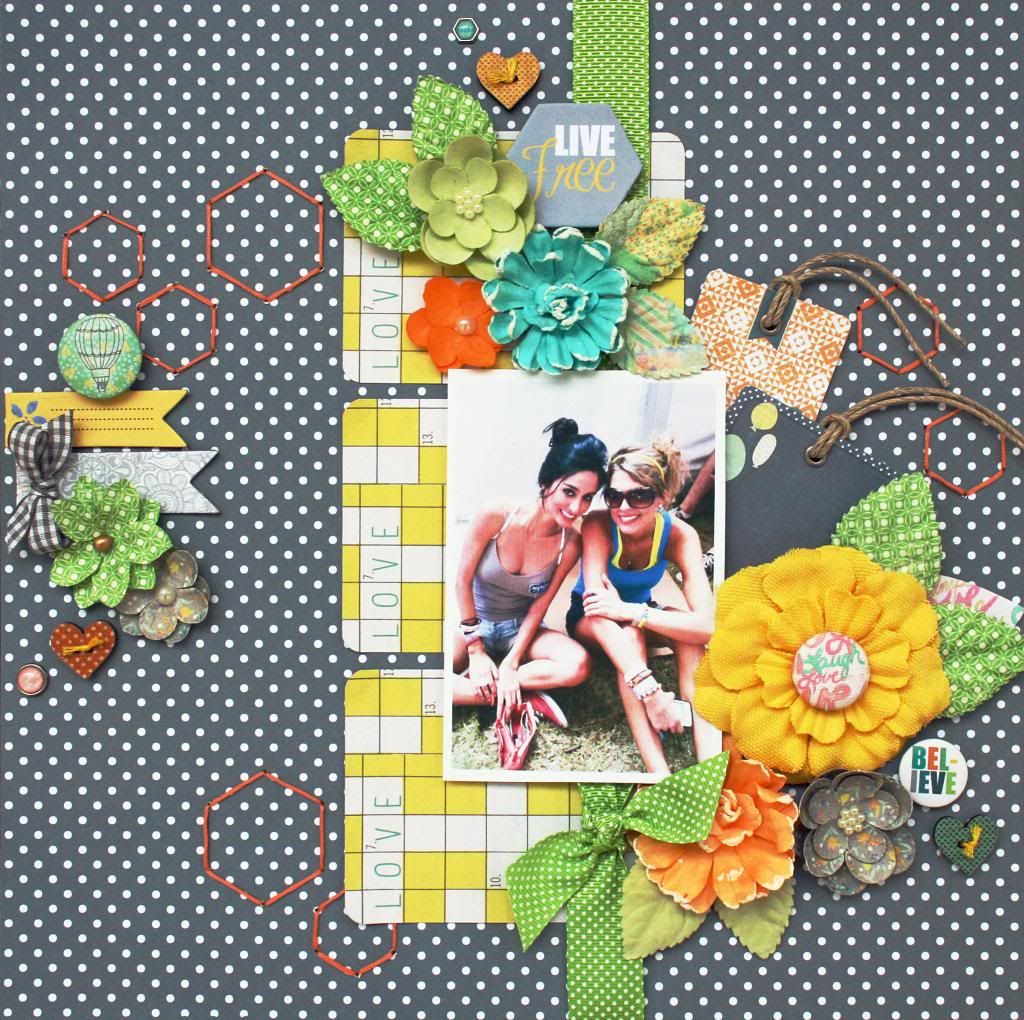
Hi everyone!  I am just sharing a layout that I made using the new Prima Free Spirit collection today.  This is my daughter and her roommate and I thought that this collection fit perfectly with their photo and with their fun outdoor activities.  

I started my design by using 3 artist trading cards as my base.  Instead of using 3 different ones, I chose to use 3 of the same.  I knew that I wanted to use lots of embellishments, so I wanted to have continuity in the base of the design.


It's a lot of fun to be friends with your kids on Facebook and photos like these are one of the reasons why. I lifted this one off my daughter's Facebook page. This generation uses Facebook so often to share their photos and it's a great source for scrapbookers to be sure to include their photos in books even when they no longer live at home.


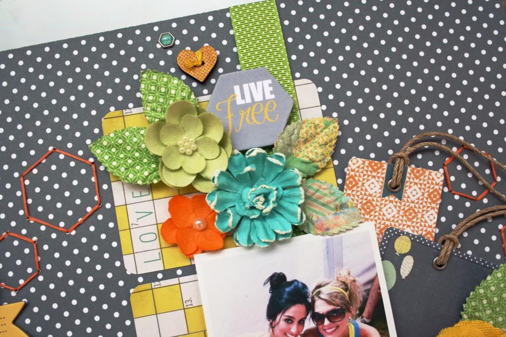
 I used flowers from both the Free Spirit Collection and also included the large yellow flower from the Bloom Collection, which we've already established that I love! 

I also like the Hexagon shaped pieces, especially the Live Free piece that I used for my title. 


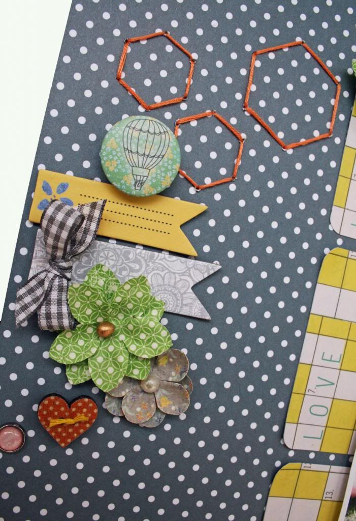
Because I really liked the hexagon shape, I decided to echo it for some additional design by stitching some simple ones in various places on my page.  

Tip:  I used a couple of my hexagon punches for a pattern for the stitching.  Just place, pierce and add simple long stitches.


Scatter some banner pieces, buttons, brads and a touch of ribbon and you're done!  Because their is very little cutting in this design, it goes together really quickly!


Photobucket

Saturday, April 5, 2014

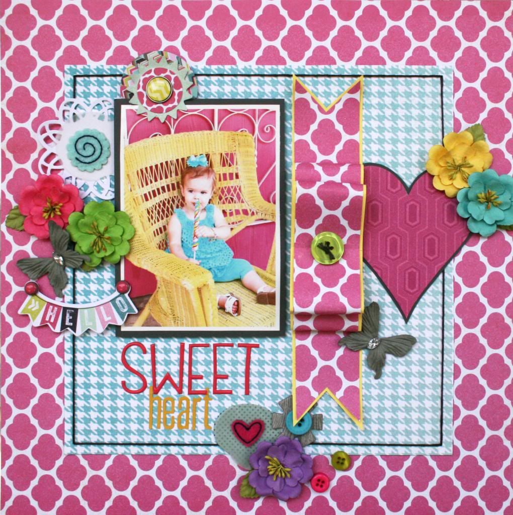
Sweet Heart

I've been having so much fun lately, playing with things in my stash!  I keep buying the best supplies and then not using them enough!  This is some My Mind's Eye Cut and Paste Collection..  As you can see, it's absolutely adorable!


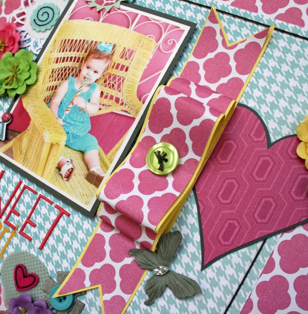
Instead of adding my usual ribbon bow, I decided to make a paper bow.  I simply cut 3 strips of patterned paper and 3 strips of yellow cardstock.  The cardstock was 1/8" wider than the patterned paper.  Glue 2 of them into loops and add banner ends to the 3rd strip.  Finish off with a button.

Tip:  Use a strong, fast drying adhesive to hold it together firmly or use a brad to hold under the button.

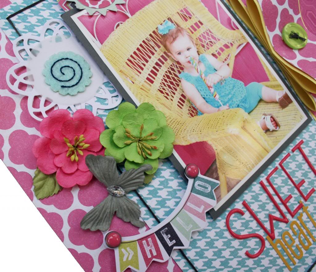
There are so many cute embellishments in this collection!  I love the doily with the felt center, especially!  I also added a few Prima flowers and butterflies to layer.


Finish it off with a 'Sweet' mixed title.  I think it's so fun to mix up letters and fonts for titles. 


Photobucket