Thursday, January 30, 2014

Leaky Shed Studio and Authentique Swap


This is a layout that I made for the Leaky Shed and Authentique Swap.  We were given some beautiful papers and stickers to play with from Authenique and mixing them with Leaky Shed Studio supplies made for a lot of great projects!  You can check out the projects and get the details of the swap at the Leaky Shed Blog.


This collection is called Smitten and is traditionally meant to be a Valentine's Collection, but I took the 'Love' theme in a different direction for my layout.  Leaky Shed Studio makes these precious wooden hearts and along with this photo of Laynee's Dedication, I thought that they all fit perfectly together to make this layout with a different theme.


I drew a heart for a pattern and used it to cut out several hearts in different prints.  I used some of them on top of the paper and simply stitched around them.  I then used two of them and placed them behind the paper, after I had cut out a bit smaller heart.  I stitched around them, too.  I like the added dimension and interest that this allowed.  

Finally, I added those precious hearts from Leaky Shed Studio with little black bows!

Don't forget to check out Leaky Shed Studio's Blog for more great ideas from the other design team members!



Photobucket

Saturday, January 25, 2014

3 Birds Studio Design Team


I've been keeping a secret and it's a good one! 

I'm excited to announce that I'm going to be joining some extremely talented ladies on the new 


Be Sure to Stop by the 3 Birds Studio Blog for upcoming collections and links to the new team's personal blogs!  

Can't wait to get started!

Photobucket

Friday, January 10, 2014

Enjoy for Leaky Shed Studio

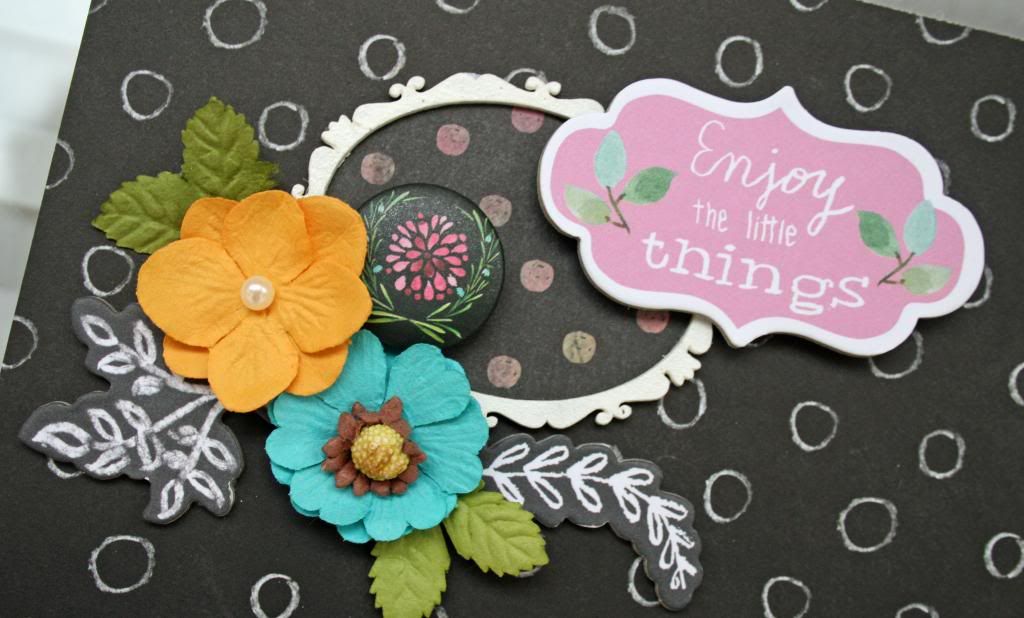
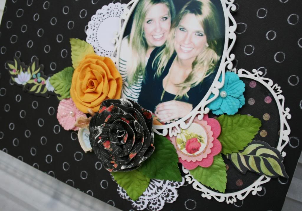
This is a layout that I made with a package of the Victorian Oval Frames from Leaky Shed Studio.  I'm a sucker for frames and these are a gorgeous example of frames done right!


I kept this pretty simple.  I painted the frames white with acrylic paint.  It took a couple of coats, but I like the way it turned out to have a bit of a chalkboard look that went really well with this paper collection.  I used Prima Optimist collection for this layout.  I LOVE this release from Prima!!


You can see from the photo above that I put a coordinated piece of paper in the center of this small frame and also in the medium frame at the bottom.  Simple and a bit of extra interest.


The photo was placed in the center of the large frame and I used foam dots to raise it up a bit so that I could tuck the other chipboard piece underneath it.

 I finished it off by adding flowers and leaves layered underneath and on top of the cluster.
Super simple and fast!

Photobucket