It's my turn to be in the spotlight at Bo Bunny's Designer Showcase!
I never am sure what to tell when I'm the focus. As those of you who already know me know, I can talk forever, but there is something about having to come up with interesting things about yourself that shuts me down fast! :) So, I decided to tell a bit about myself, make a new layout and to share some of my old favorites.
I would love it if you would take a peek at the Bo Bunny Blog to check it out.
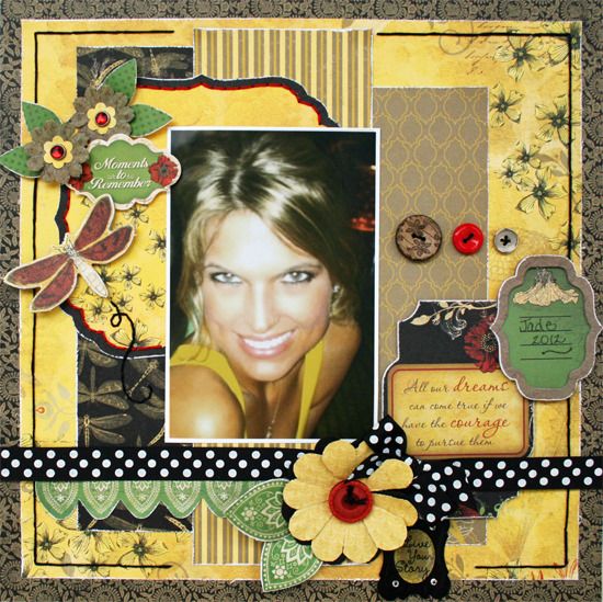
Here is the new layout that I did for the post...
As those of you with older children know, it is harder to get recent pictures of
your kids when they aren't living at home. Thank goodness for Facebook! Without
it, I would probably only have Christmas and other holiday pictures. The layout
that I am sharing today is a lift off of my daughter's facebook. Even though she
has a camera, she usually just uses her phone to take pictures. Some of them
won't make it to the page, but some of them end up looking really great and way
more fun than the perfect pictures I'm always trying to get.
I used the gorgeous new Serenade Collection to make this one. I chose to really
play up the yellows in the collection to go with her photo. Between her yellow
top and the extra saturated picture, it was a perfect match!
When I'm putting together a page,
I like to add lots of little details. Because I tend to be drawn to EVERYTHING
when it comes to embellishments, I always try to ask myself if I see the
pictures. It is important to me to have my photos take center stage.
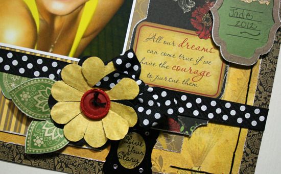
This close-up shows some of the details that I love to do for my pages. Stitching almost always shows up on my pages and I love clustering and shaped papers and stickers. Keeping it to the edges of my phot with just a bit of overlapping helps to keep all this from overwhelming my photo.
This close-up shows some of the details that I love to do for my pages. Stitching almost always shows up on my pages and I love clustering and shaped papers and stickers. Keeping it to the edges of my phot with just a bit of overlapping helps to keep all this from overwhelming my photo.
More clustering and a touch of
fussy cutting make a showing on the bottom of the page. I couldn't help but make
leaves out of the patterned paper. Of course, if you are familiar with my work,
you will now that a ribbon or bow almost always ends up being added. If you
haven't tried the Double Dot ribbon, you need to! I LOVE how it has the dots on
both sides to make tying bows and knots a snap!
Be sure to drop by Bo Bunny to check out all the new collections and to take a peek at the latest challenges! There is always so much going on over there!


Another fab page, I may just have to scrap lift this one. I just became your newest follower.
ReplyDeleteBTW did you know that you have the dreaded word verification on your blog?